Yo!pals
Yo!pals, a language-matching and culture-sharing app where people meet language partners from around the world and practise together. Mobile app and website.
- Client
- Yo!pals
- Agency
- Astro Dijital
- Services
- Mobile AppWebsite
- Live
- yopals.com/en ↗
- App Store
- apps.apple.com ↗
- Google Play
- play.google.com ↗
The product
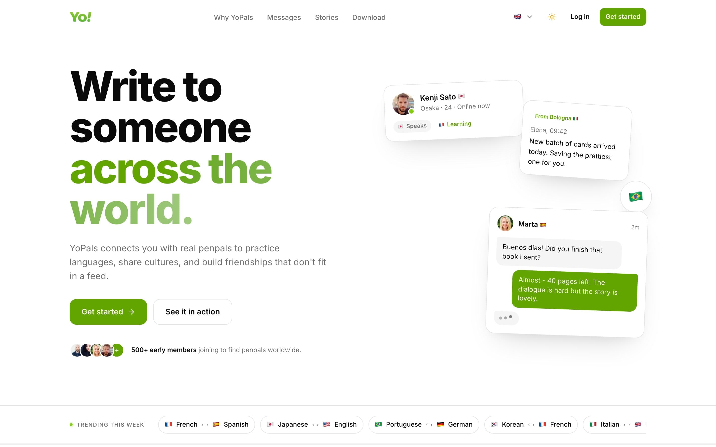
Yo!pals is a language-matching and culture-sharing app. It helps people meet language partners from around the world, practise together and turn language learning into a habit they enjoy.
My role
We took Yo!pals from idea to release at Astro Dijital: product concept, UI/UX design, mobile development and launch, plus the website.
The idea
A language sticks when you use it with someone. So the app skips the lessons and puts a real person on the other side: find a partner, say hello, keep talking.
The app
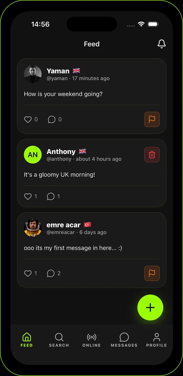
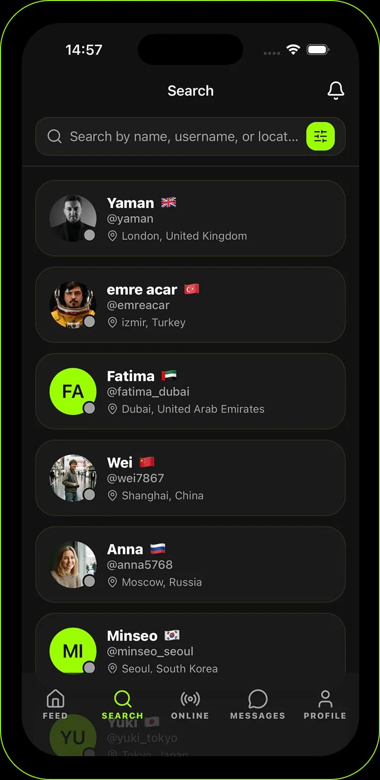
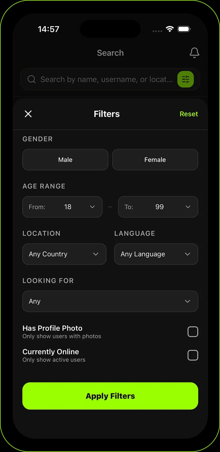
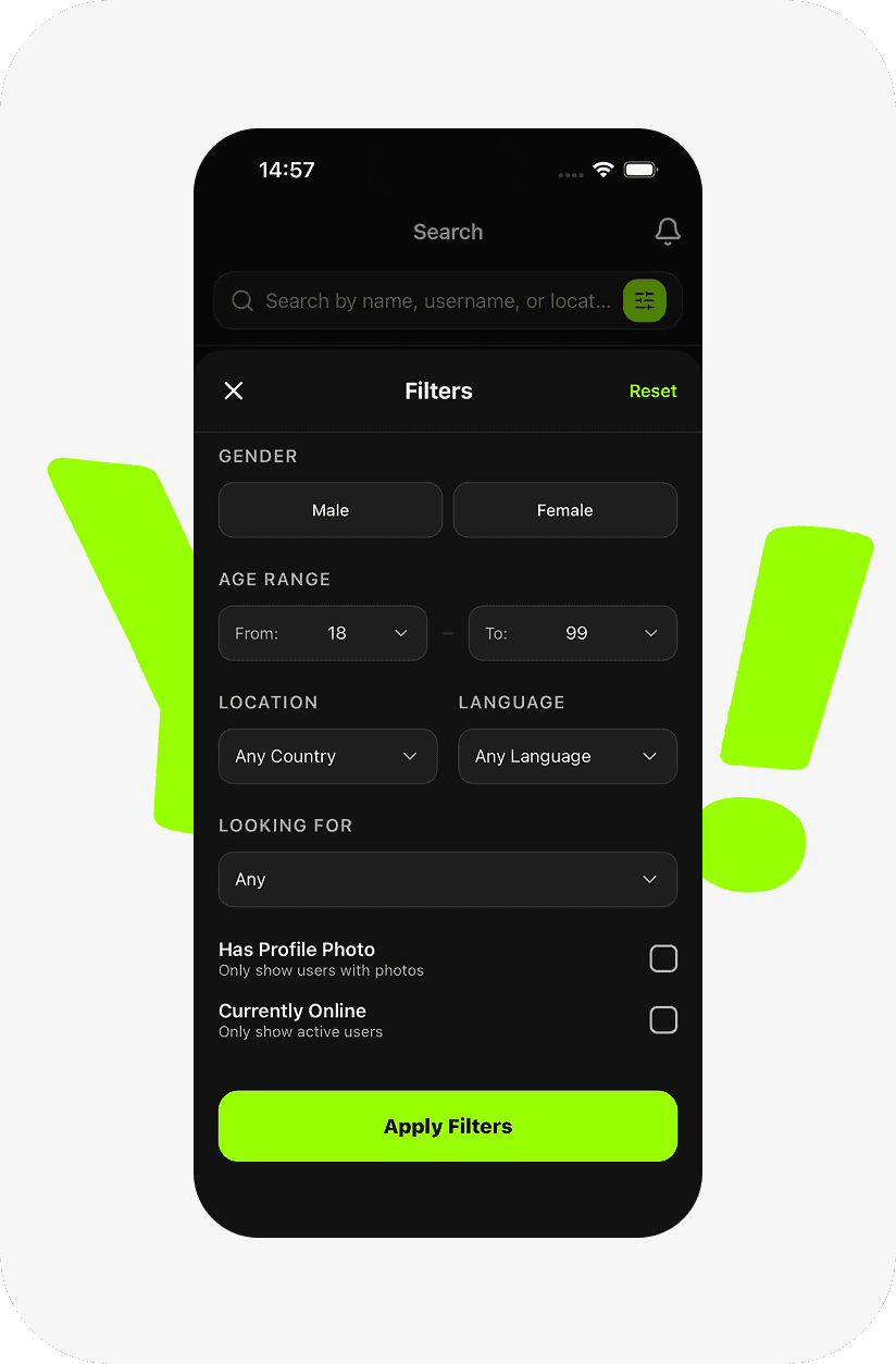
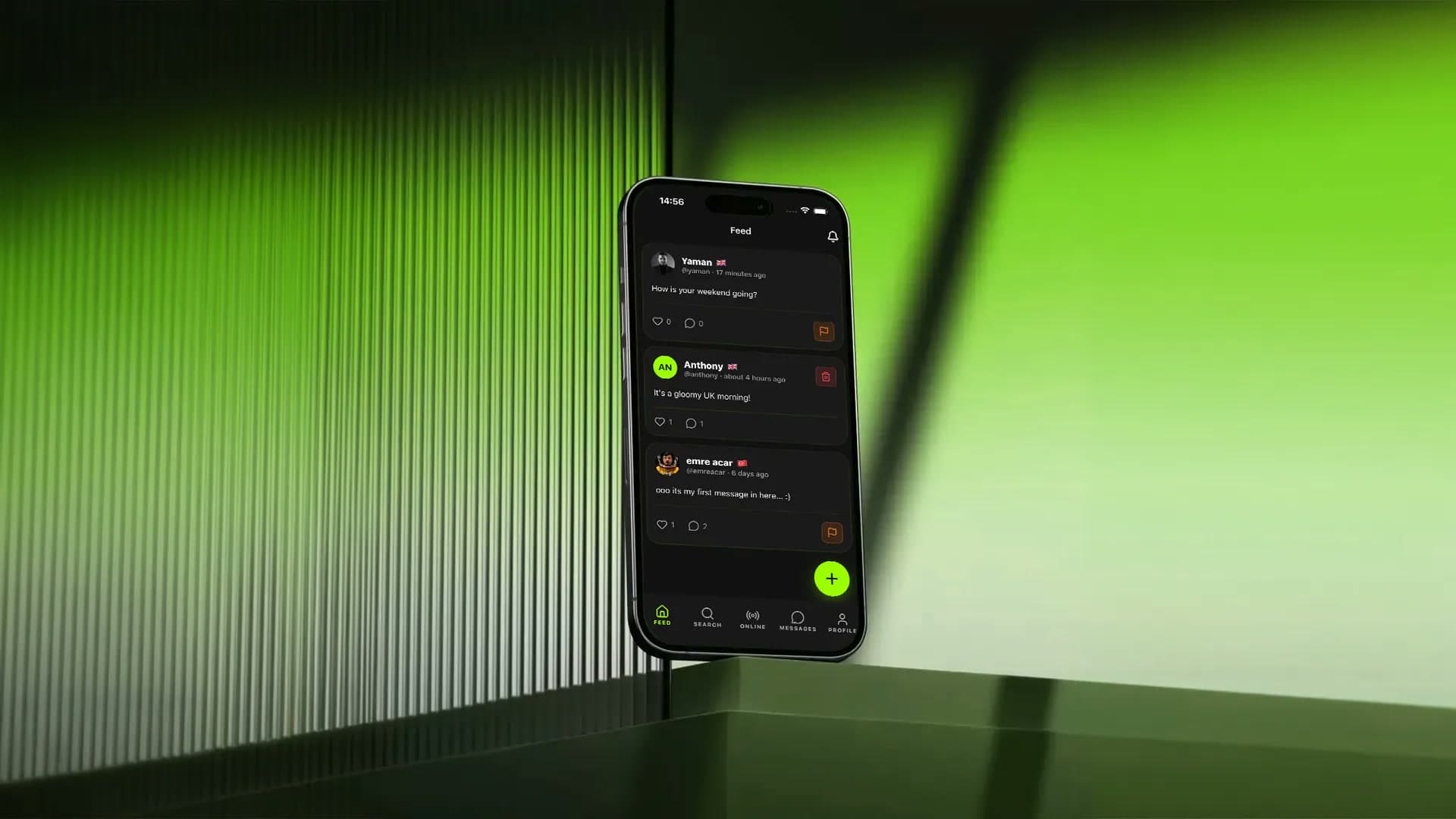
Five tabs carry the whole experience: a feed of short posts from the community, a search to find partners, a list of who is online, messages and your profile. Filters narrow partners down by language, location, age and what they are looking for, so the first hello goes to the right person.
- Community feed
- Partner search with filters
- Online now
- One-to-one messages
- Profile

Talk with everyone
Three words hold the brand together: connect, chat, learn. The same greeting sounds different in every language, and that is the point of the app, so the brand speaks in several languages at once.
connect. chat. learn



Hey, Kumpel! Was geht?
Yo, pal! What’s up?
Salut, mon pote !
Visual language
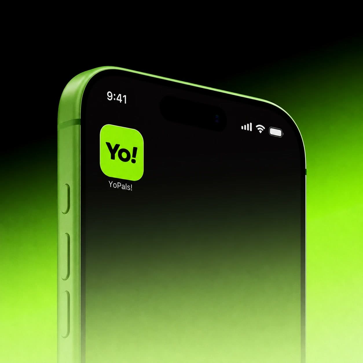
A near-black base and one loud lime green. The green marks everything you can act on, from the send button to the active tab, and the Yo! mark turns the app’s first word into its logo.
- Midnight Navy#0A0E1A
- Lime Green#93FF00
- Soft Lime#D9FFA2
- Light Gray#F6F6F6
Typography
Inter
- Regular
- Bold
Next project