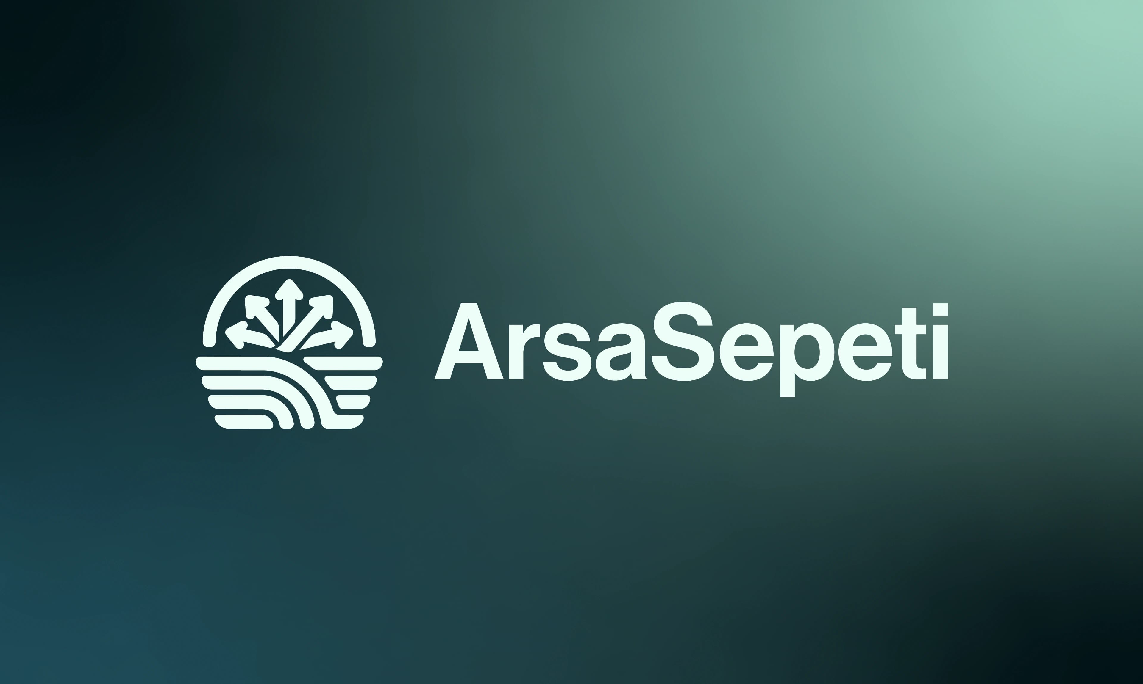
Arsa Sepeti
Brand identity for Arsa Sepeti, a new-generation land investment platform that uses AI-supported analysis to turn the right plot into the right investment.
- Client
- Arsa Sepeti
- Agency
- Astro Dijital
- Services
- Branding
The product
Arsa Sepeti is a new-generation platform for land investment. It uses AI-supported analysis to help investors find the right plot, in the right place, at the right time.
My role
I designed the brand identity: the logo and its meaning, the colour and type system, the icon set, and how the brand looks on screens and on printed pieces.
The idea
Not a listing site, but a technology platform. Land investment should rest on data, not on guesswork, so the brand had to feel calm, exact and trustworthy.
The brand
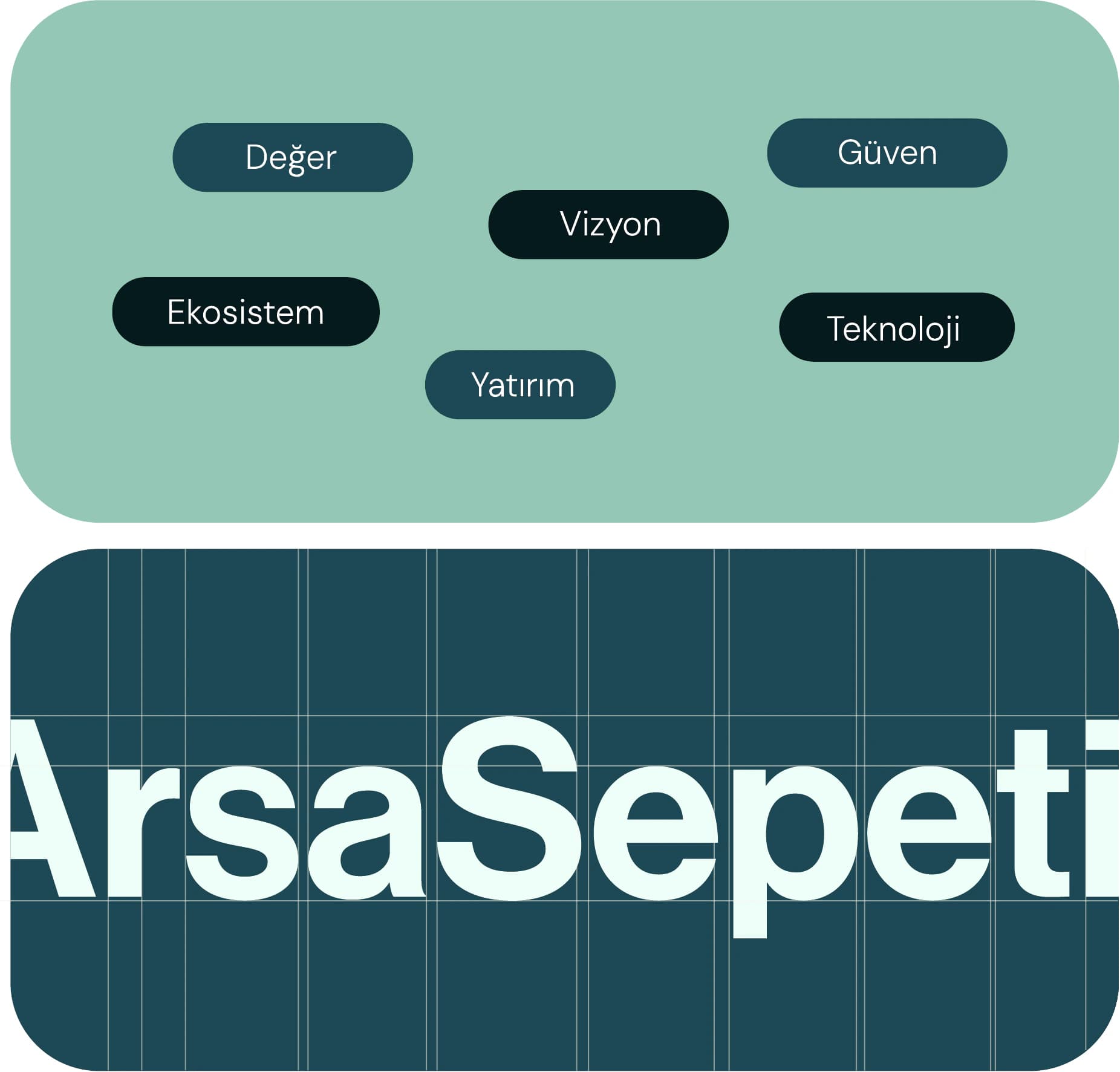
The name means “land basket”: every opportunity gathered in one place. The brand’s promise is “from Türkiye to the world, millions of parcels on one platform”, and four values keep it honest.

Values
01
Trust
Every plot, every analysis and every suggestion is transparent and can be verified.
02
Expertise
We know the sector and read the data, so the right decision gets easier.
03
Technology
AI is not just a tool here. It is the heart of the platform.
04
Access
From the local investor to the global buyer, the platform feels made for each of them.
The logo
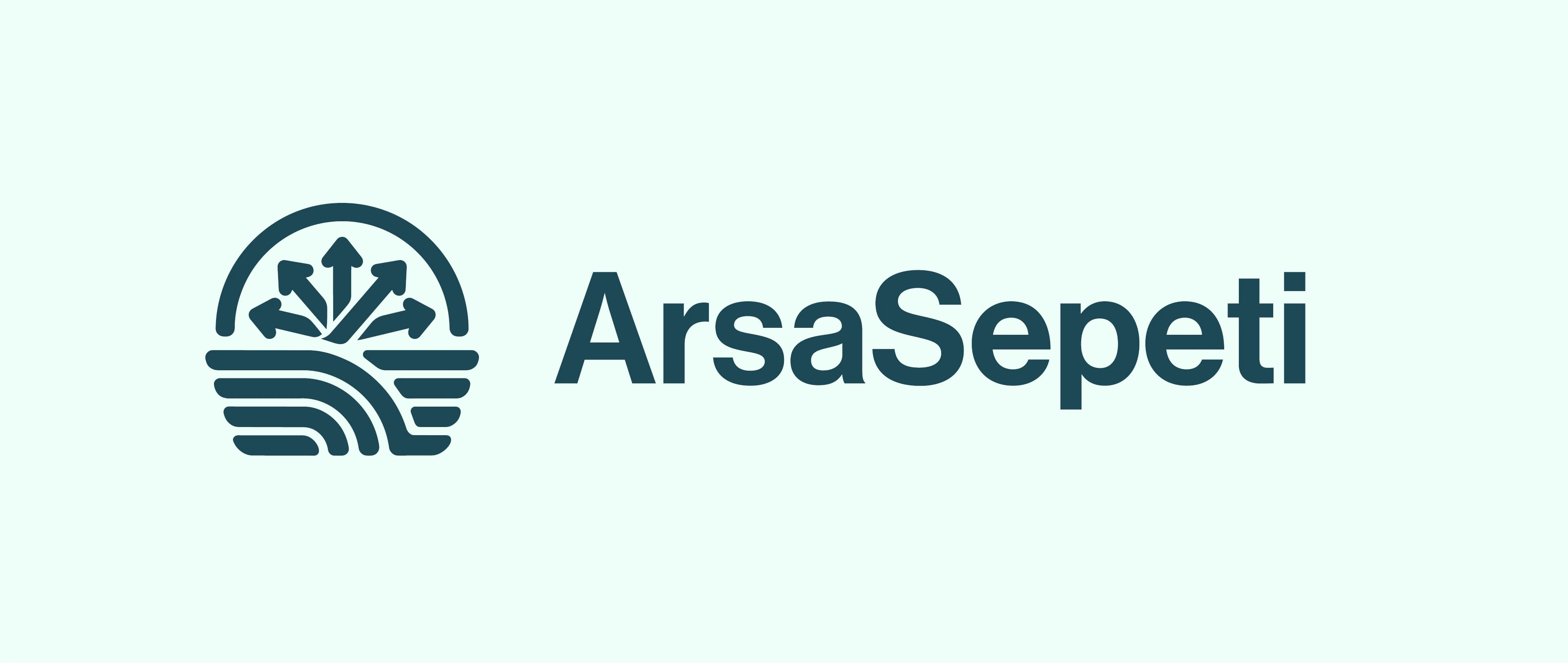
The mark stands on a strong base built from a land grid, with a rising-value symbol on top. The arrows stand for an investment that grows, and the basket shape says that every opportunity is collected on one platform. Together they show a platform that creates investment value, not one that only lists plots.
- Land & parcel
- Analysis
- Basket
- Investment
 Land & parcel
 Analysis
 Basket
 Investment
Visual system
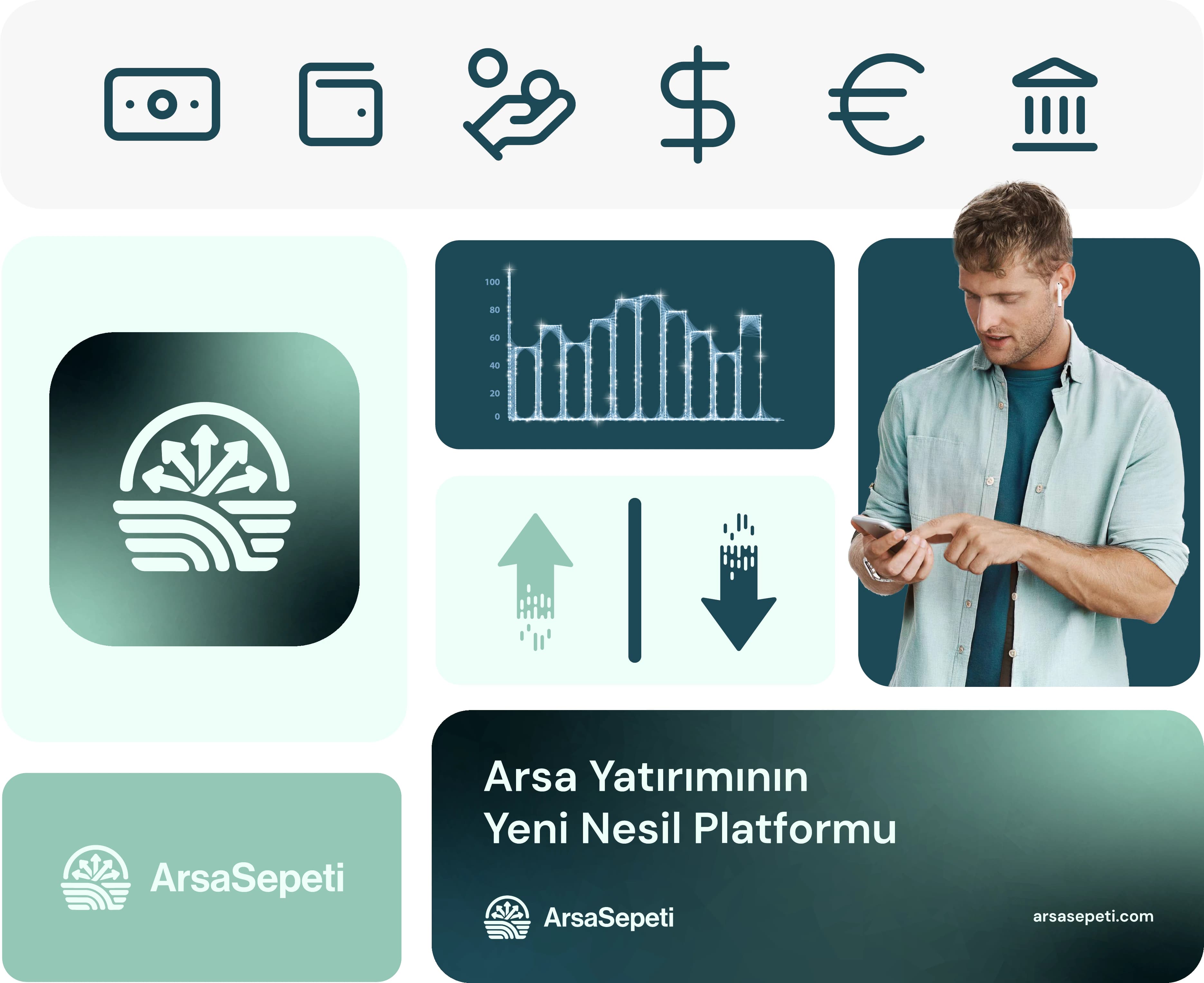
Five teal tones run from near-black to pale mint, so the brand can be dark and serious or light and open. DM Sans carries the interface and the body text, and Neue Haas Grotesk Medium sets the wordmark. A line icon set for money and finance, data charts and soft gradients complete the system.
- Colour palette
- Typography
- Finance icon set
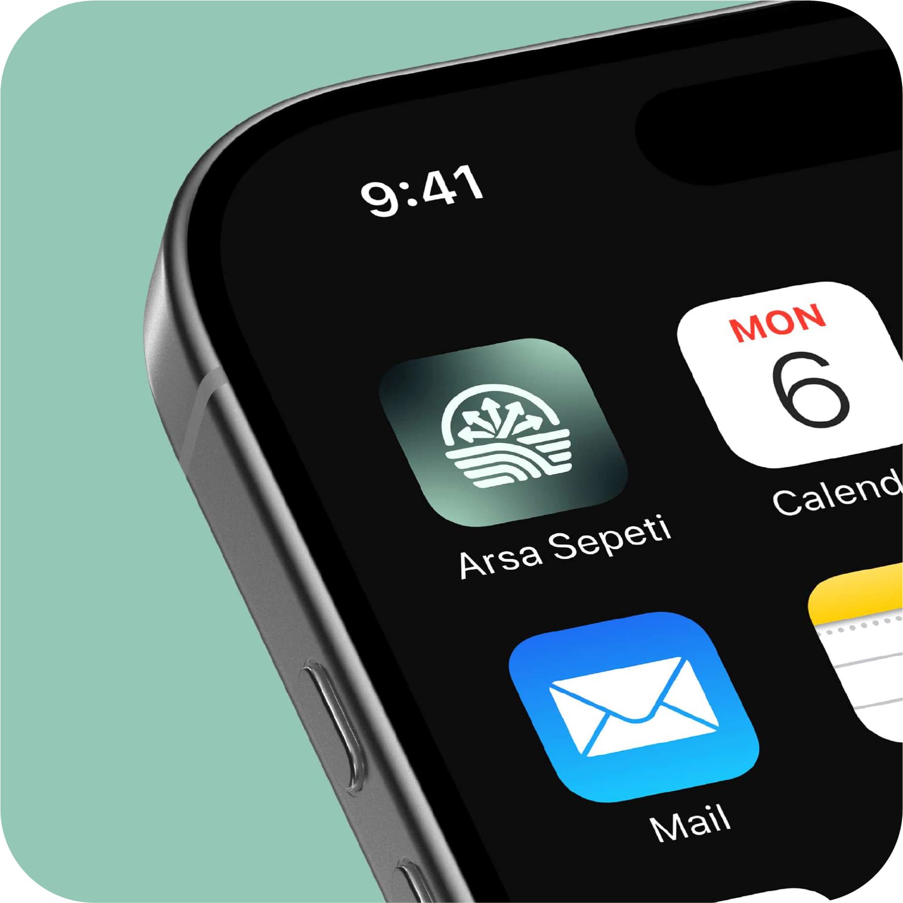
- App icon & social assets
- Midnight Teal#06191C
- Deep Teal#1D4854
- Ocean Teal#94C7B5
- Pale Mint#EEFFF9
- Light Gray#F7F7F7
Typography
DM Sans
- Regular
- Bold
In use
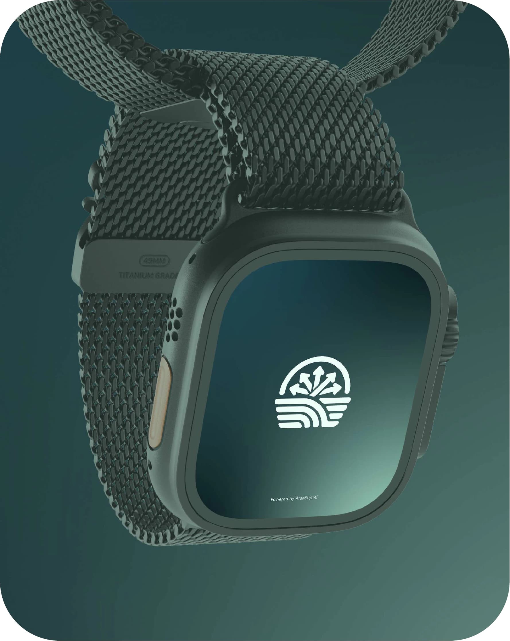
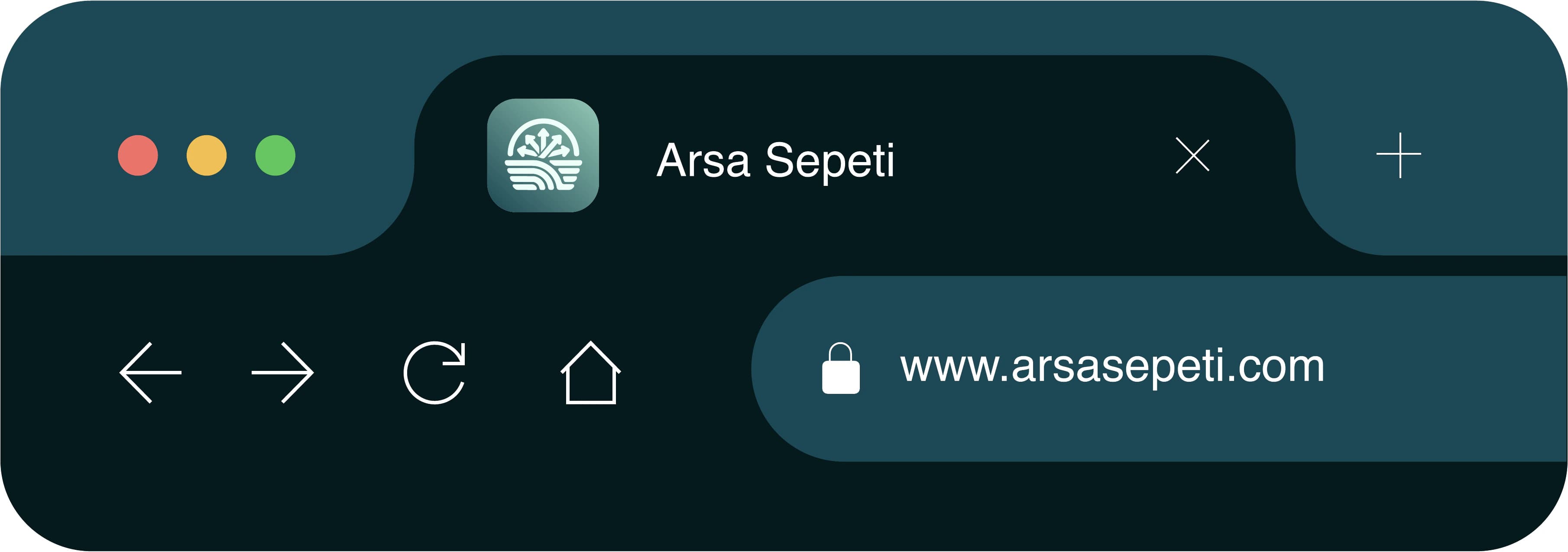
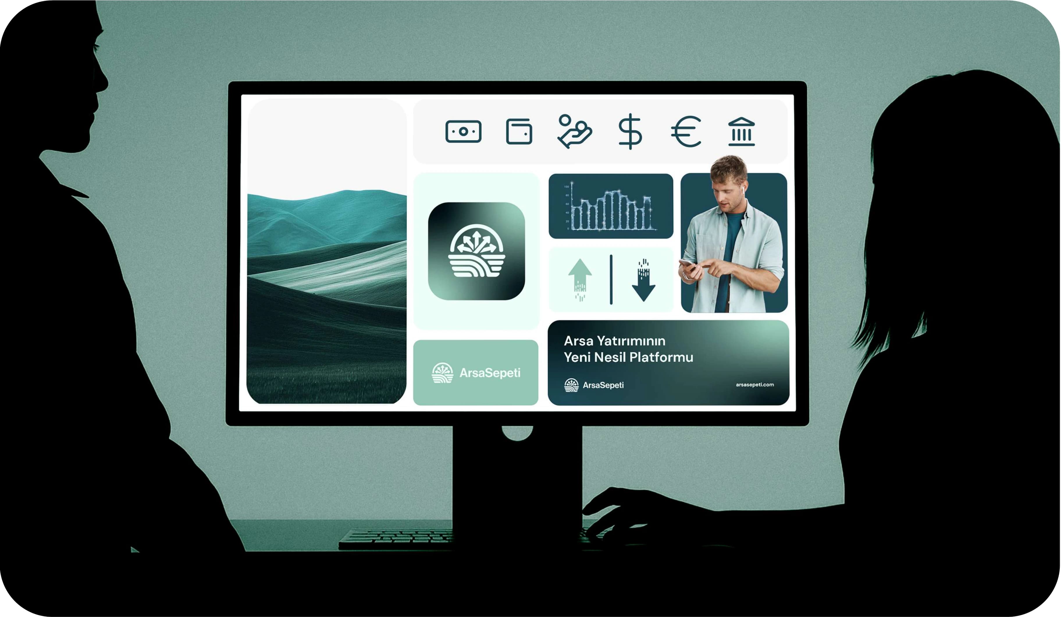
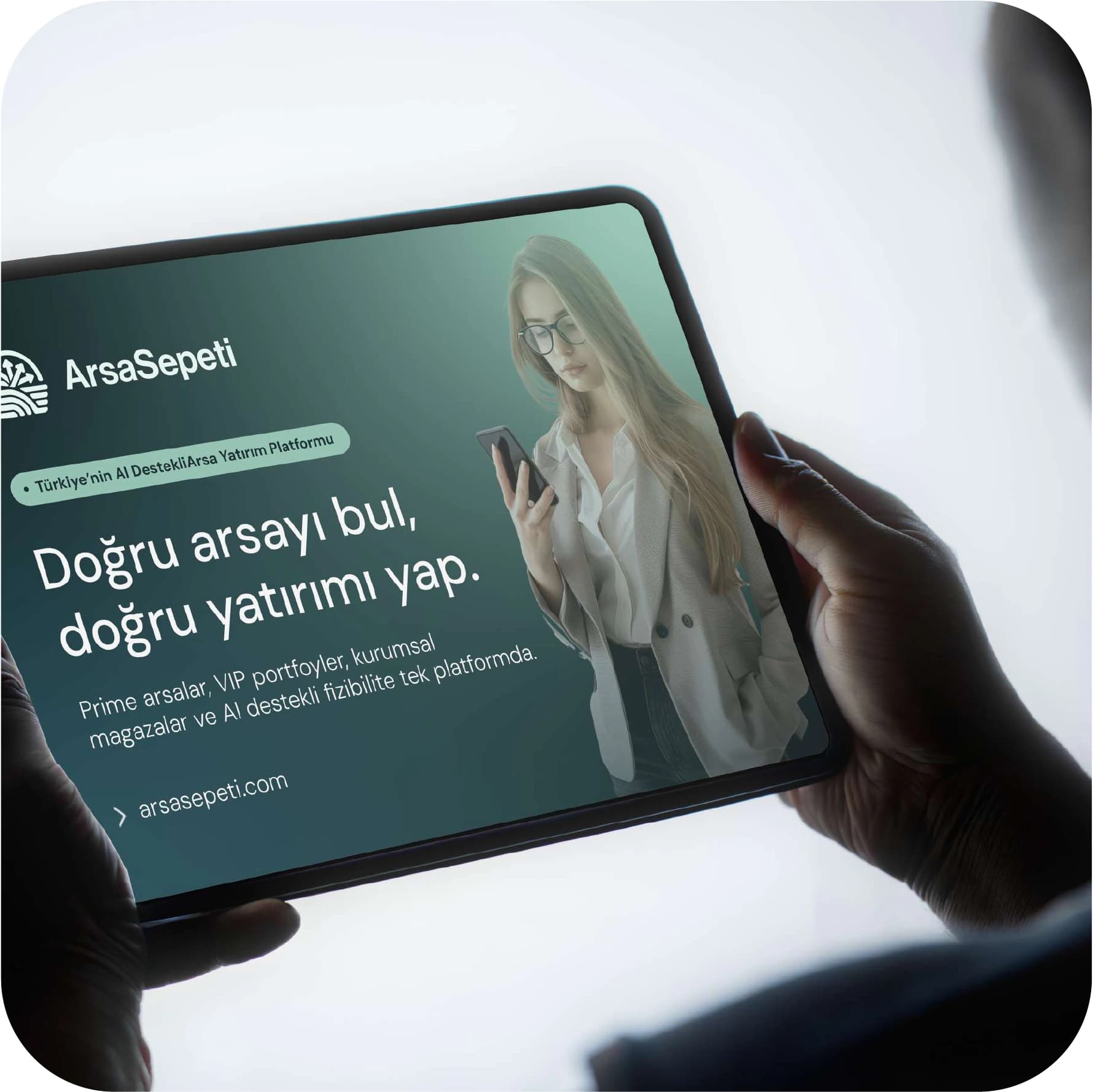
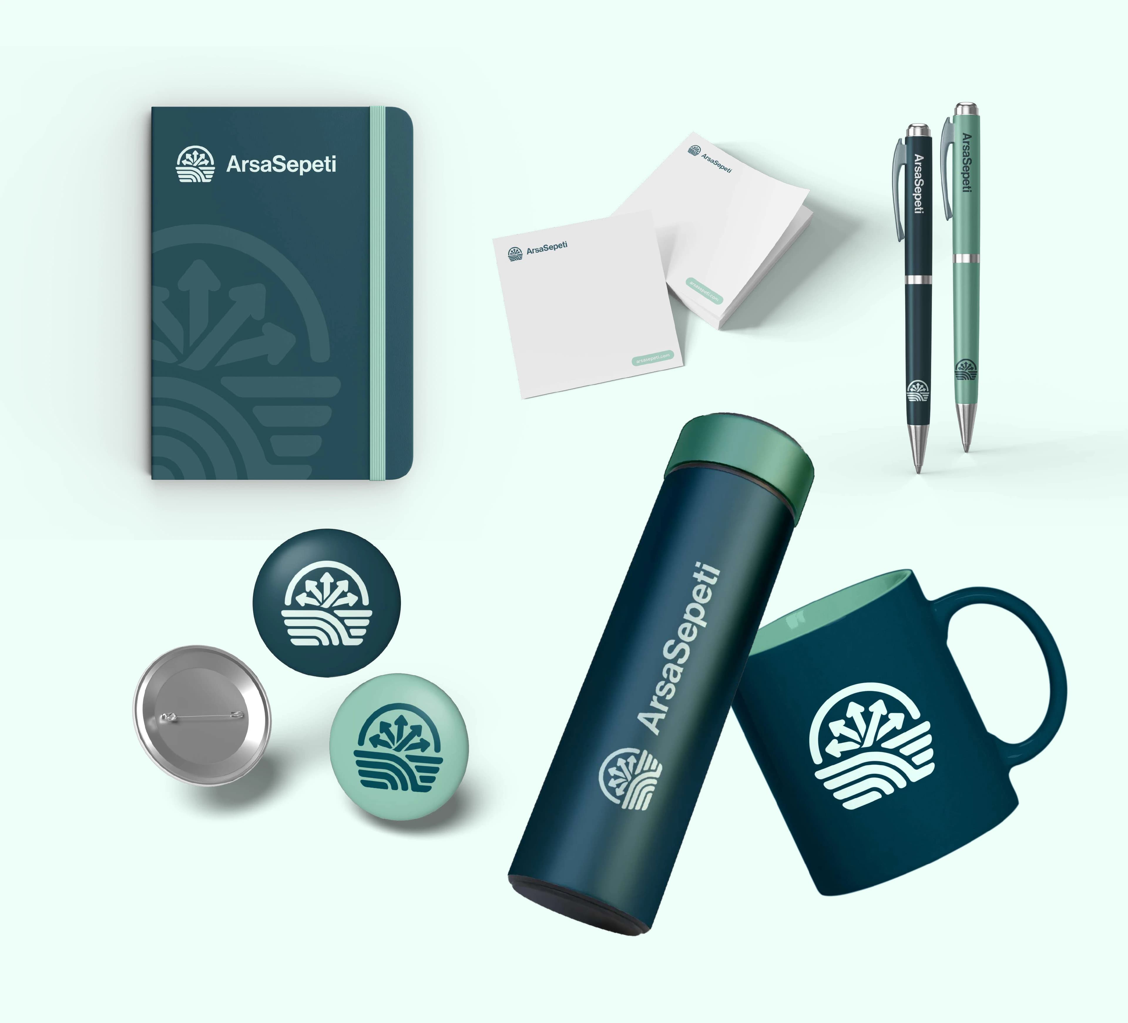
The identity was tested where an investor would meet it: the app on a phone and a watch, the website in a browser tab, a tablet and a desktop screen, the social profile, and promotional items for corporate clients.
- Mobile app & watch
- Website
- Social media
- Corporate gifts


Going global
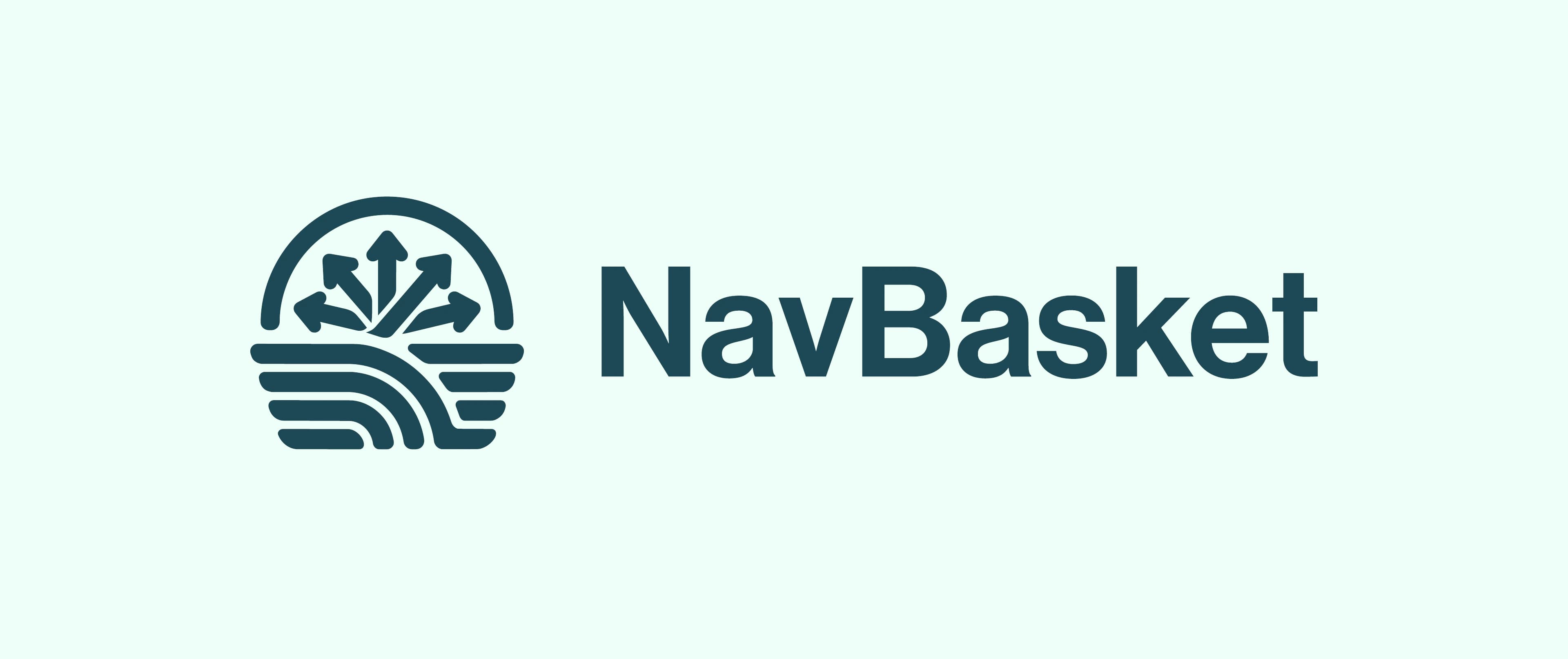
The platform is planned for buyers outside Türkiye too, so the brand has an English name: NavBasket. It keeps the same mark, colours and type, and only the wordmark changes.
Next project